When you get down to it, every online business is simply a collection of webpages. And for an ecommerce brand, one type of page is by far the most important:
Your product offer pages.
Now, when we talk about product offer pages, we’re referring to the pages on your website where people can actually buy your products.
You might also call these “sales pages,” or “landing pages” (since these are where most of your visitors land when they visit your site).
And generally speaking, there are three main types of Shopify landing pages that you can use to feature your products:
- Traditional Product Pages
- Long-form Product Pages
- Product “Mini-sites”
In this article, you’ll learn what each of these landing pages looks like, their pros and cons, and when it’s best to use one page type versus another.
By the end, you’ll be able to choose the best type of Shopify landing page to maximize the sales of each and every one of your products.
TRADITIONAL SHOPIFY LANDING PAGES
First up, let’s take a look at a traditional Shopify landing page. This is your old-school ecommerce product page, so it should look familiar.
Here’s an example:
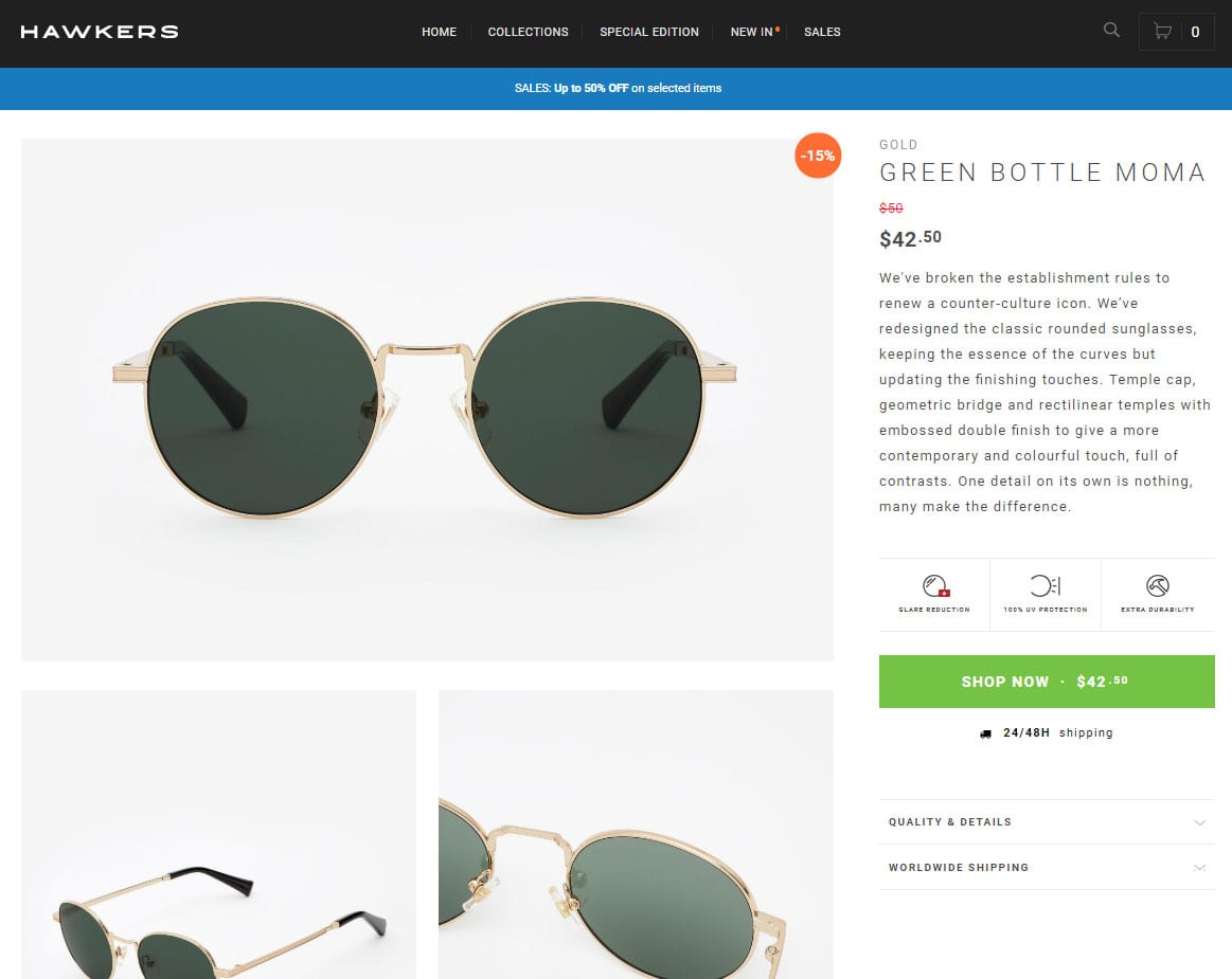
GOLD · GREEN BOTTLE MOMA
The first thing most people will notice when they come to a page like this is the big product image taking up most of the screen. It’s big, it’s bold, and it’s right in your face.
Bam! Here’s a pair of great-looking sunglasses.
And that is pretty typical of traditional Shopify landing pages. They tend to be image-focused, with lots of eye-catching pictures showing the product from multiple angles.
On the other hand, there’s not much text (or copy) on the page. The product description is often just a paragraph or so.
This example has a little more copy, but you have to click “Quality & Details” to see it. So when you click here…
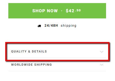
The section expands, accordion-style, to give you more product details through a list of bullet points:
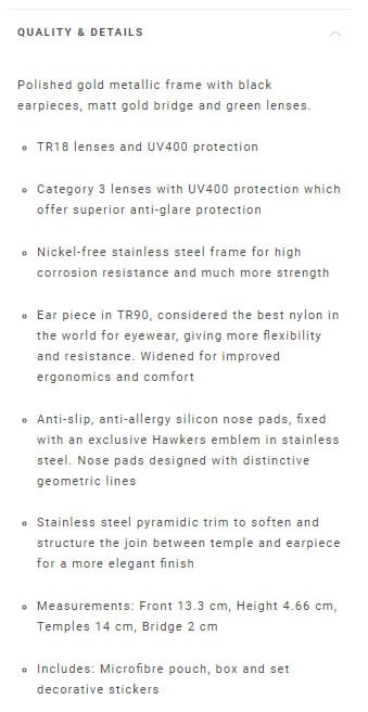
But the fact that you have to click just to see this copy shows you how important it is. (Not very.)
So what’s the deal with these pages? Why are they designed this way?
The answer is actually pretty interesting. See, back in the day—before mobile traffic took over the Internet—people didn’t scroll as much. If you had content farther down on your page, not many people would scroll down to see it.
So designers started adding things like sliders to websites as a way of taking a brand’s conversion elements (or, any piece of content/design on the page that is meant to influence the sale) and cramming as much as they could above the fold.
And that’s why traditional Shopify landing pages are laid out the way they are. In the case of the sunglasses brand, you’ll notice that the three most important conversion elements on the page—the image, the copy, and the “Buy” button—are all right at the top of the page.
Here, take another look:

Today, most people use their phones more than they use their desktop. And you have to scroll on your phone—it’s required. So the issue of people not scrolling isn’t much of a problem anymore.
But here’s the important thing to remember: even though these traditional pages were designed for a different era, they can still work today!
Yeah, they’re a little old-fashioned, but in the right situation, one of these landing pages can convert like gangbusters.
WHEN SHOULD YOU USE THIS TYPE OF SHOPIFY LANDING PAGE?
To recap: these are image-heavy pages, with a small amount of copy and a “Buy” button that is usually present above the fold.
So when would you want to use a page like this?
Based on the pros and cons, here are six use cases that make a traditional type of Shopify landing page a good idea.
1) When you have a visual product that requires an image-heavy page.
Because these are image-focused pages, it makes sense they would work well for visual products like jewelry, art, home accessories, and oh yeah—clothes:
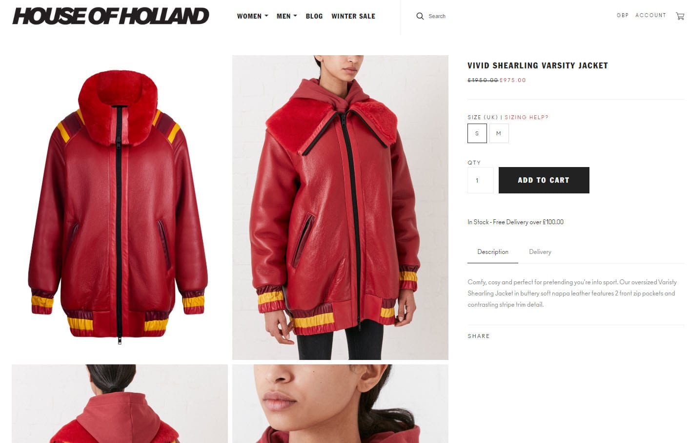
HTTPS://WWW.HOUSEOFHOLLAND.CO.UK/PRODUCTS/VIVID-SHEARLING-VARSITY-JACKET
If your product is better described with pictures than with words, then a traditional Shopify landing page might just be what you need.
2) When there isn’t a lot to explain about your product.
These landing pages tend to work best when you don’t need much copy to sell your product. If you’re selling a typical pair of sunglasses, there isn’t much else to say except, “These are sunglasses! Here’s what they look like! Want to buy them?”
3) When you already have a strong pre-sell before the person gets to the page.
Here’s a question to keep in mind: Where does this landing page fit into your overall marketing funnel?
Take these 2 scenarios for example:

In the first scenario, you’re driving traffic straight to your landing page. In this case, if your product does need explaining, then your landing page will probably need a decent amount of content to convince people that they should buy your product.
But in the second scenario, you’re actually doing most of the selling in a separate pre-sell article or video. So by the time the visitor hits your product landing page, they’re already convinced. In this case, your landing page doesn’t need to do much except remind the visitor why they should buy and give them a chance to do it.
4) When the page is intended for repeat buyers.
If you’re selling a product made for repeat purchases—like shampoo, Keurig coffee pods, electric toothbrush heads, and so on—then most visitors don’t need much convincing to buy. They’re probably already using the product, and just need a way to re-order it when they run out.
In these cases, a traditional landing page will work just fine.
5) When you’re selling a low-ticket item.
Generally speaking, the less expensive your product is, the less sales copy required to get somebody to buy it.
A $1,000 product probably needs a long-form landing page. But if your product is only $25, then a traditional landing page will likely work because you don’t need a lot of copy to sell it.
That being said, if you feel that you have good, persuasive sales copy—use it! No matter the price of your product. It could make the difference between the buyer choosing your product over a competitor’s.
6) When you’re a mobile-focused brand.
Companies that drive most of their traffic on mobile tend to use traditional product pages. This is because traditional product pages usually leverage less content, making them lightweight and faster loading. (Page load speeds have a direct effect on conversions: sluggish pages equals sluggish sales!)
The truth is, however, that this isn’t always a good idea, since longer-form pages can sometimes convert better for certain products, even on mobile.
We recommend testing what type of Shopify landing page works best for you. In other words: if you’re a mobile-focused brand, don’t use a traditional Shopify landing page just because you see other mobile-focused brands doing it.
Test it for yourself and see what generates the most sales for you.r)
EXAMPLES OF TRADITIONAL SHOPIFY LANDING PAGES
Now that you have a pretty good idea of what a traditional product landing page looks like and you know when to use them, let’s take a look at a few examples of companies that are doing a good job at leveraging them.
We’re not going to dive into too much detail about the actual conversion elements on the page (the images, the copy, the reviews, etc.). We will cover that in a later article.
For now, we’re just going to focus on the overall impression, structure, and layout of the page.
And as you’ll soon see, most of these pages have a similar layout.
Here’s a face and eye cream from Bee Friendly Skincare:
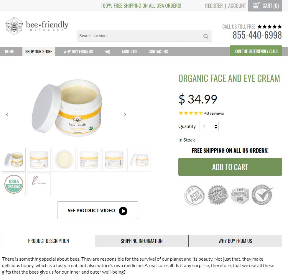
ORGANIC FACE AND EYE CREAM
Here’s another skin care product, a coffee scrub that helped launch the company Frank Body:
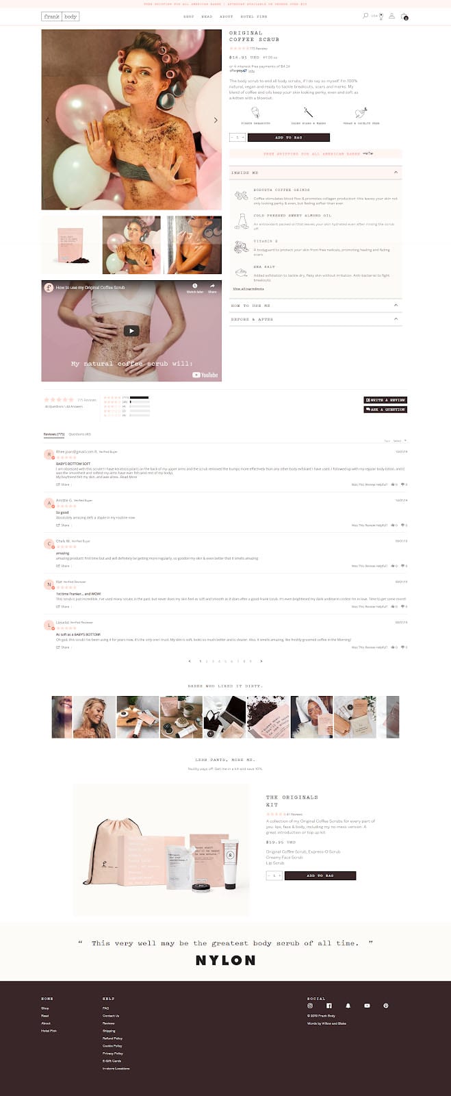
ORIGINAL COFFEE SCRUB
As you can see from these pages, along with the ones we’ve already shown above, they all have a similar layout:
Big product images on the left (preferably with a video thrown in there too), with a little sales copy and the “Add to Cart” button on the right.
It’s a familiar design, which means that most of your visitors won’t have any trouble navigating these pages.
But while these traditional product landing pages are familiar, they’re also a little old-fashioned. And for a lot of products, companies are getting better results using a different type of Shopify landing page: a long-form product page.
LONG-FORM SHOPIFY LANDING PAGES
If the traditional product page is short and to the point, then this is the exact opposite: a long page with lots of copy, lots of pictures, and lots of conversion elements to help educate your visitors and persuade them to buy your product.
Unlike the traditional product page, there’s no one-size-fits-all layout for a long-form landing page. The layout varies from one brand to another, depending on which conversion elements you want to include to show your product in the best possible light.
Direct response marketers have known for decades just how effective a long, copy-heavy sales piece can be, so this is nothing new.
Why is long-form content so effective? The answer should be pretty obvious:
It gives you an opportunity to say more!
You can do more selling. You can do more educating. You can spend more time building up the value of your product and explaining the benefits to the visitor.
As you might be able to tell, here at Zipify we’re big fans of long-form Shopify product landing pages. We don’t recommend using them all the time, but there are certain situations when a long-form page makes a lot of sense.
WHEN SHOULD YOU USE THIS TYPE OF SHOPIFY LANDING PAGE?
So what are those situations? When does it make the most sense to roll with a long-form product page?
We’ve identified six primary use cases for this type of Shopify landing page:
1) When you have a direct response marketer in charge.
Direct response marketing is intended to get a person to take a specific and measurable action. In our case, that action is to buy your product.
In order for a long-form page to be effective, it should be created according to the principles of direct response marketing.
That’s why, in order to get the best results from a long-form landing page, it really helps if you have a direct response marketer on your team (and preferably in charge).
And there’s another team member who is also really helpful to have around…
2) When you have a good copywriter on the team.
This goes hand-in-hand with use case #1 (above). Just as it’s important to have direct response marketing experience, it’s also critical to have a great copywriter on your team—preferably one who knows how to write direct response-style copy.
Because remember: these pages are long and full of text. So of course it makes sense that you’ll need someone who’s able to write that copy as clearly and as persuasively as possible.
3) When you have a lifestyle or story-based product.
Because these pages give you a lot more room to tell stories, they work really well when your product is based around a certain lifestyle, like Boosted Boards (see below), or requires the telling of a story, like Purple Mattress (see below).
4) When you can visually demonstrate how well your product works.
If there’s a way to demonstrate your product in action and actually show people how effective it is—through something like video demonstrations or before-and-after pictures—that’s definitely something you want to include on your product page and might require the use of a long-form format.
Demoing your product is a really powerful selling tool. It helps clarify what your product does and how it works, answers questions and clears up confusion, provides visual proof of effectiveness, and helps your visitor to actually see themselves using your product.
And when they can do that, they’re a lot more likely to buy.
5) When you have to educate the person before they’ll buy.
Why should someone buy a Purple Mattress instead of a regular memory foam mattress? Well, the Purple Mattress company actually has a really effective sales pitch that answers that question.
But in order for it to work, a little education is required.
In Purple’s case, they have to explain some of the issues with memory foam mattresses and how those can lead to problems like poor sleep and back pain. Then they have to educate you on how their mattress solves those problems and results in a better night’s sleep.
As you can imagine, fitting all this educational content into your product page pretty much requires a long-form format.
Education is often an issue when you have a product that features new technology or new developments that you have to explain to your visitors in order to help them understand why the product is worth buying.
6) When you’re selling high-ticket items.
Remember: the more expensive your product is, the more selling you have to do to convince people to buy it.
If you’re trying to market a product like Boosted Board, for example, you’re going to need to spend quite a bit of time explaining to people why they should shell out $800-$1,600 for this electric skateboard when they can get a regular skateboard for less than $100.
And in order to fit all that content on your sales page, you’ll need to go long-form.
EXAMPLES OF LONG-FORM SHOPIFY LANDING PAGES
We’re going to share three different long-form pages. Let’s start with Purple Mattress:
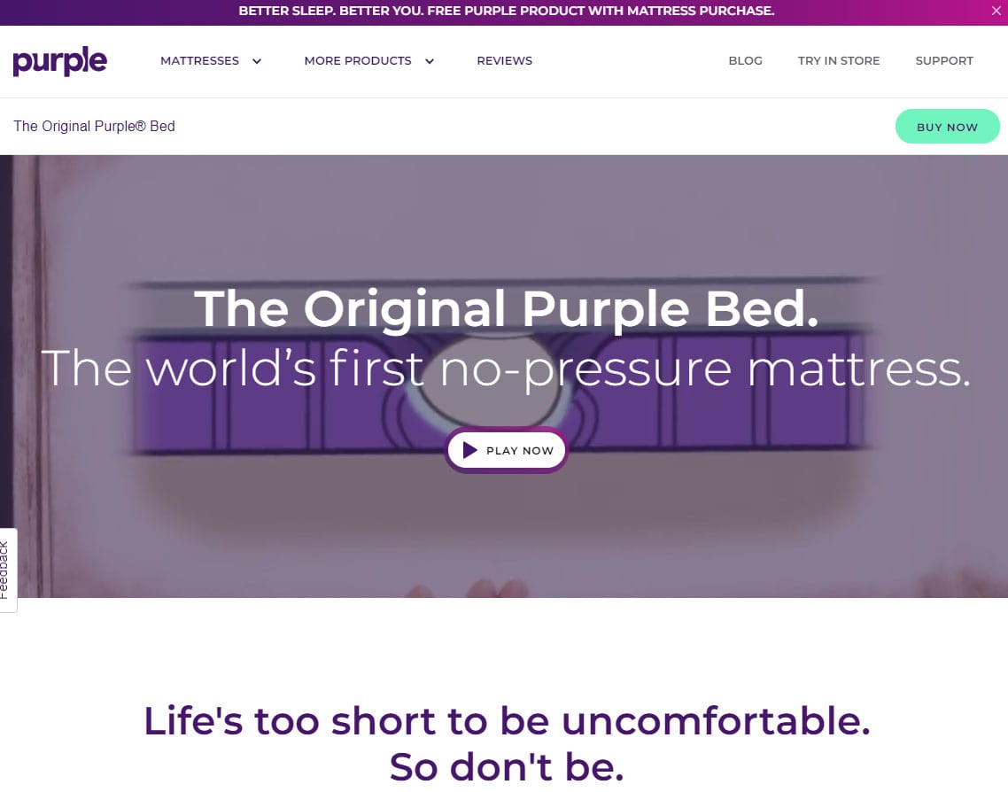
HTTPS://PURPLE.COM/MATTRESSES/PURPLE-BED
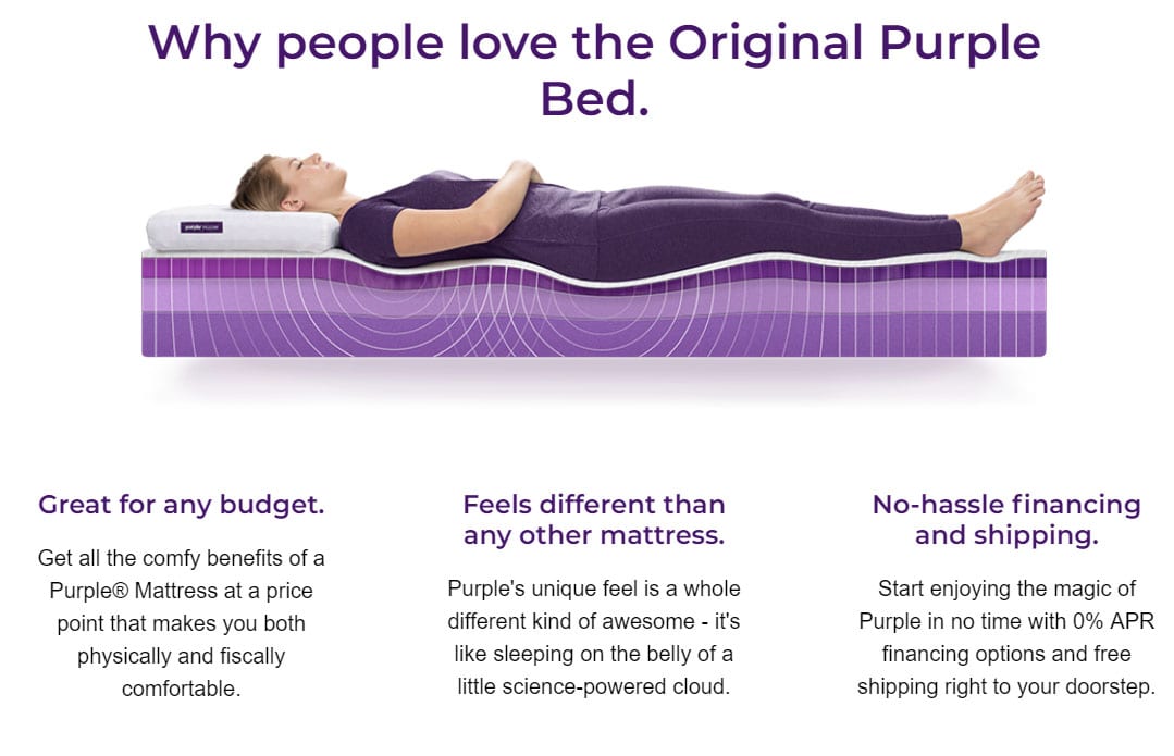
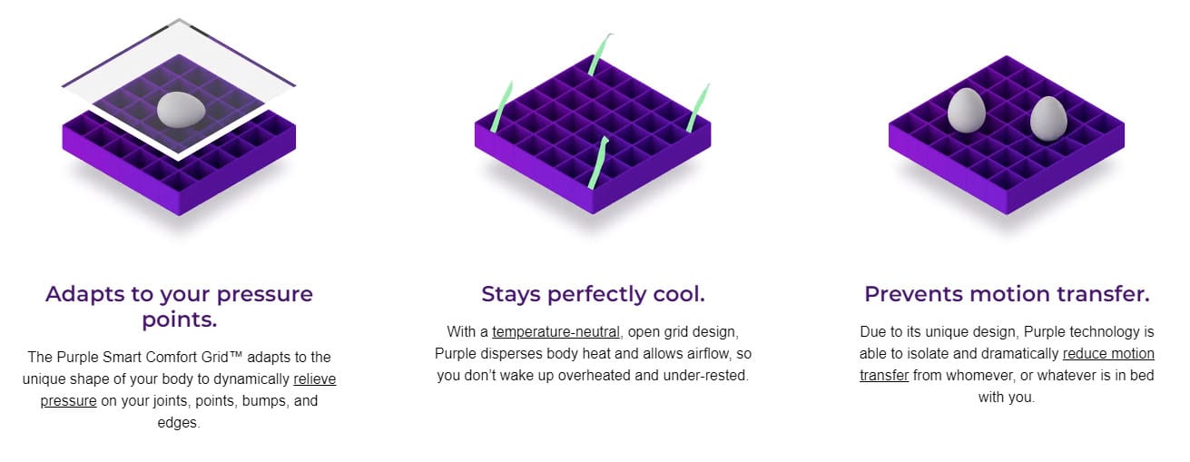
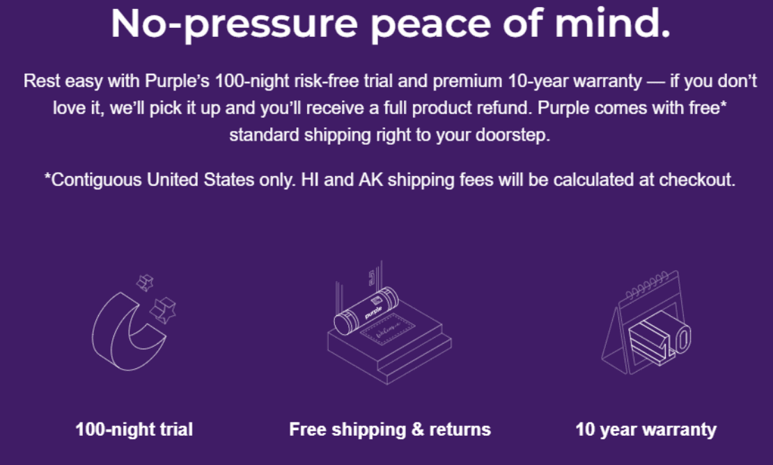
A quick scroll down the page will reveal that it’s quite long, with different sections devoted to explaining a different feature or benefit of the product. Like this one:
Or this one:
Or this one:
Notice that Purple doesn’t try to cram too much information into one section. Instead, they break it up into many different chunks, making sure each section is short and easy to read.
When you format your page like this, you can include a lot of content and people will still read it because it’s easy to consume. Purple does a great job with this. Just look at all the different conversion elements they leverage on one page:
- A funny story-based awareness video
- Product images
- Graphics and copy explaining product benefits
- Shipping & return policy
- Product reviews
- Frequently asked questions
- Links to related accessories
The end result is a page that’s long, but never intimidating. Here’s the whole thing so you can see just how long it goes:

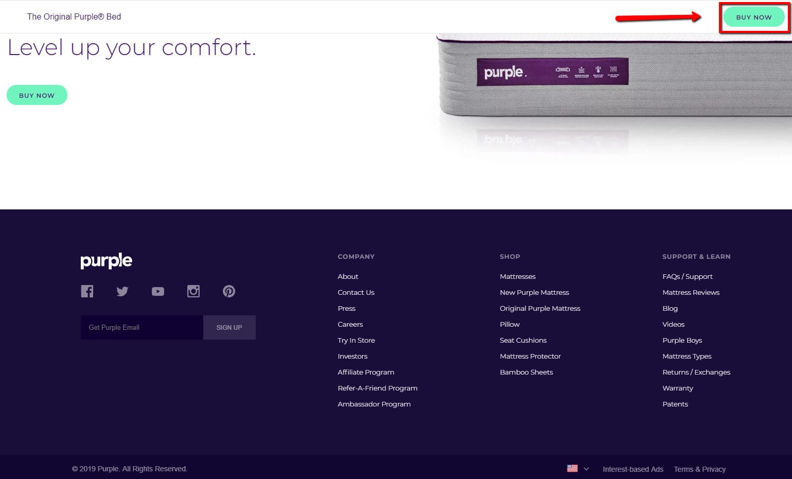
Another thing Purple does that’s really smart is use a “sticky” header, which remains stuck to the top of the page as a visitor scrolls. This way there’s always a “Buy Now” button visible.
Even if you scroll all the way down to the footer, there it is…
Another company that has a great long-form landing page is Boosted Boards. Now, if you just glanced at the top of this landing page, you might think it was a traditional ecommerce page:
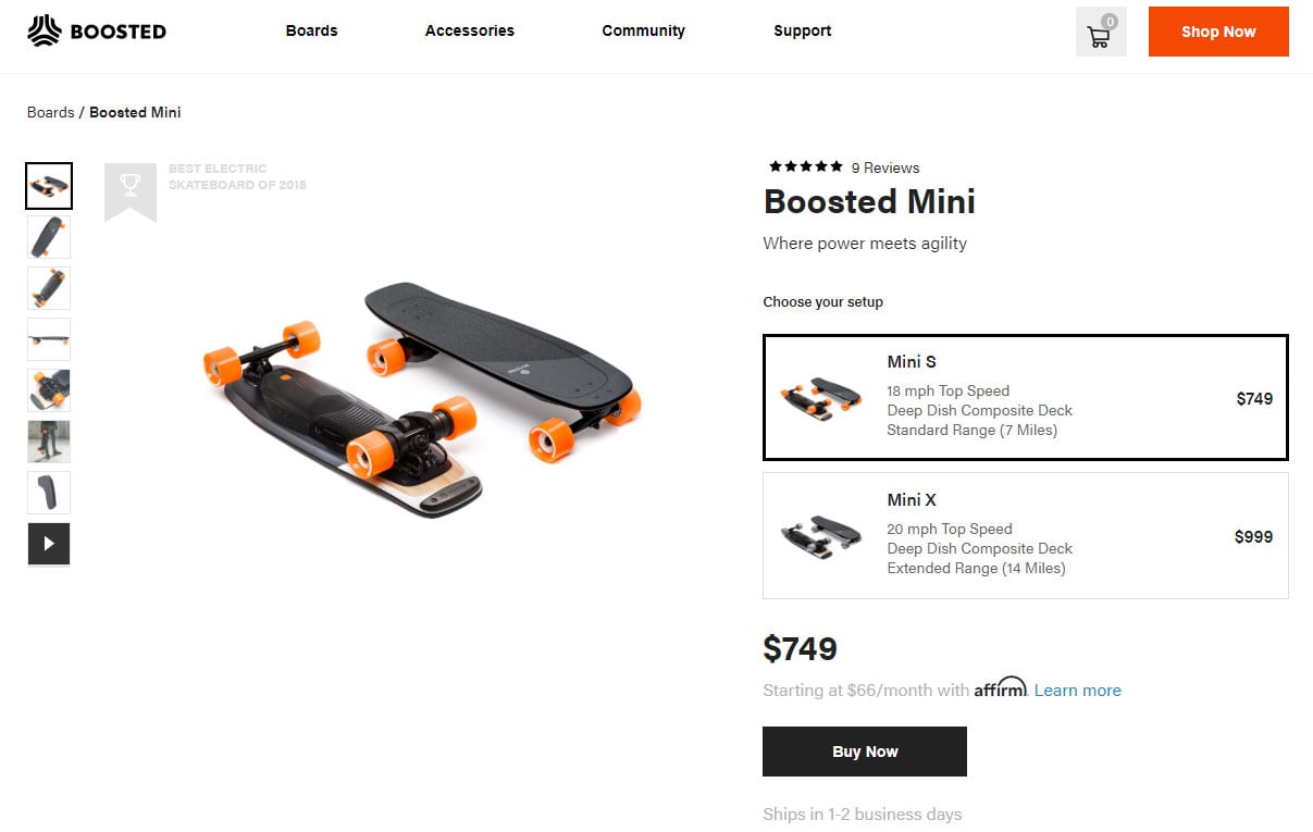
HTTPS://BOOSTEDBOARDS.COM/BOARDS/BOOSTED-MINI
But when you scroll down you’ll see it has a lot more content below the fold: lots of high-quality photos and copy explaining how the boards work, and of course, a whole bunch of positive reviews.
So this is really a hybrid page, of sorts. It’s traditional at the top, but long-form under the fold. This is a smart way to do it because you get the benefits of both worlds.
Here’s the whole page so you can see it in all its long-form glory:

For another example check out BOOM! by Cindy Joseph, a $20 million/year Shopify brand created by Zipify CEO Ezra Firestone. They take a similar approach for this product bundle, where above the fold it looks like a traditional product page:
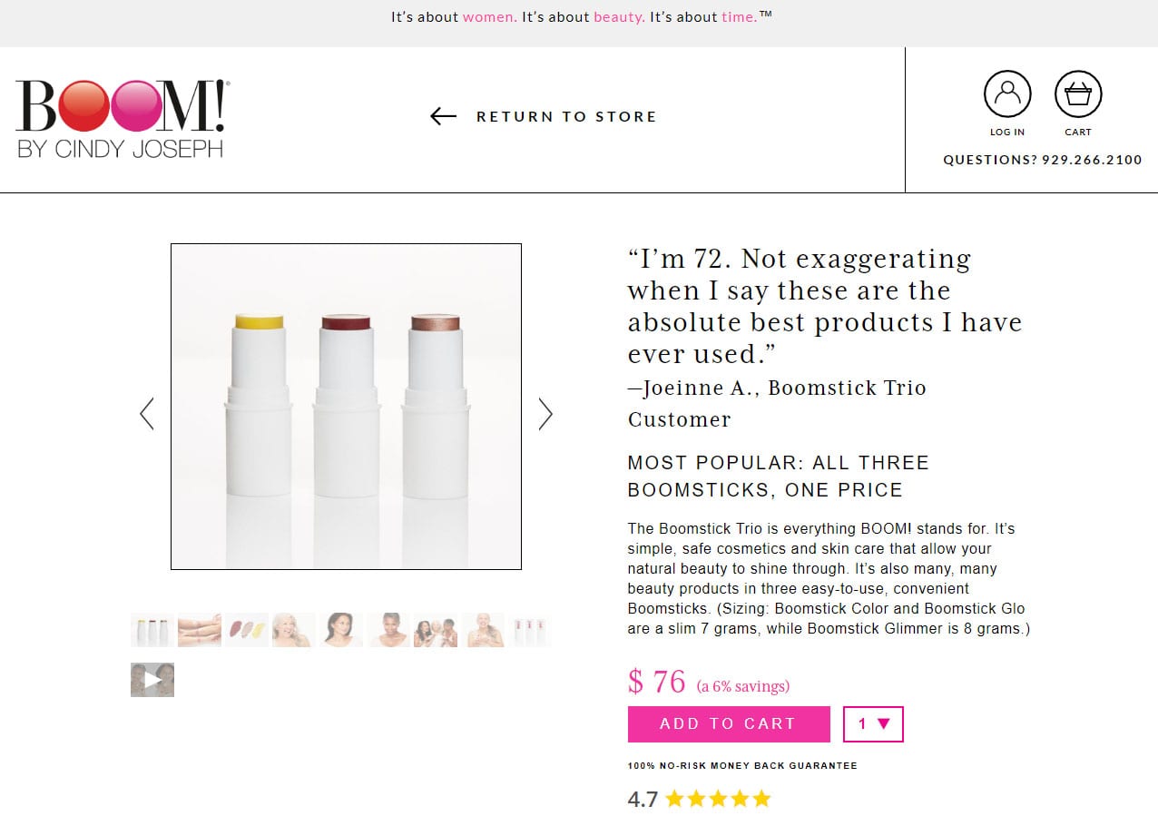
BOOMSTICK TRIO
But when you scroll down you see additional videos, reviews, and copy points explaining the benefits of the products:
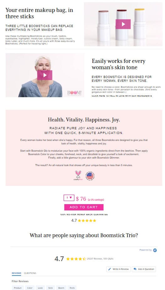
Here at Zipify, we’re big fans of long-form pages because they allow you to dive into the features and benefits of your product in detail. As a result, you can more effectively sell the visitor on why it’s a great product and why they should buy it.
But as much as we love long-form pages, we can’t call them our favorite. That’s because there’s a new type of Shopify landing page that has been wowing us with its effectiveness…
“MINI-SITE” SHOPIFY LANDING PAGES
The third and final type of Shopify landing page is a relatively new concept for physical products:
The product mini-site.
And this is just what it sounds like. You create an entire website for your product.
It’s not a huge website—probably just a few pages. It’s kind of like taking a long-form product page and breaking it up into several smaller pages.
This way, instead of having everything on one long page—your videos, reviews, features/benefits, FAQ, etc.—you can put them each on a different page and link to them through a navigation menu at the top.
Like this:

And that’s really important. Having that menu at the top makes it a lot easier for people to navigate a mini-site versus scrolling through a super-long page (especially on their phone).
In other words, it makes the content easier to consume.
Ezra has been testing these in some of his ecommerce companies, and they’re converting really well. They’re even out-performing long-form sales pages in most cases.
So, should you consider using a mini-site for your product? When is a good time to use this landing page structure?
WHEN SHOULD YOU USE THIS TYPE OF SHOPIFY LANDING PAGE?
There’s one really obvious time to use a mini-site:
When you have a single-item brand.
If your entire brand consists of one main product, then creating a mini-site is your best option.
Take Nuraphone, for example.
Nuraphone sells one primary product: high-end headphones that adapt to your unique hearing. And when you visit their website, you’ll see a mini-site with several pages all devoted to selling that one product:
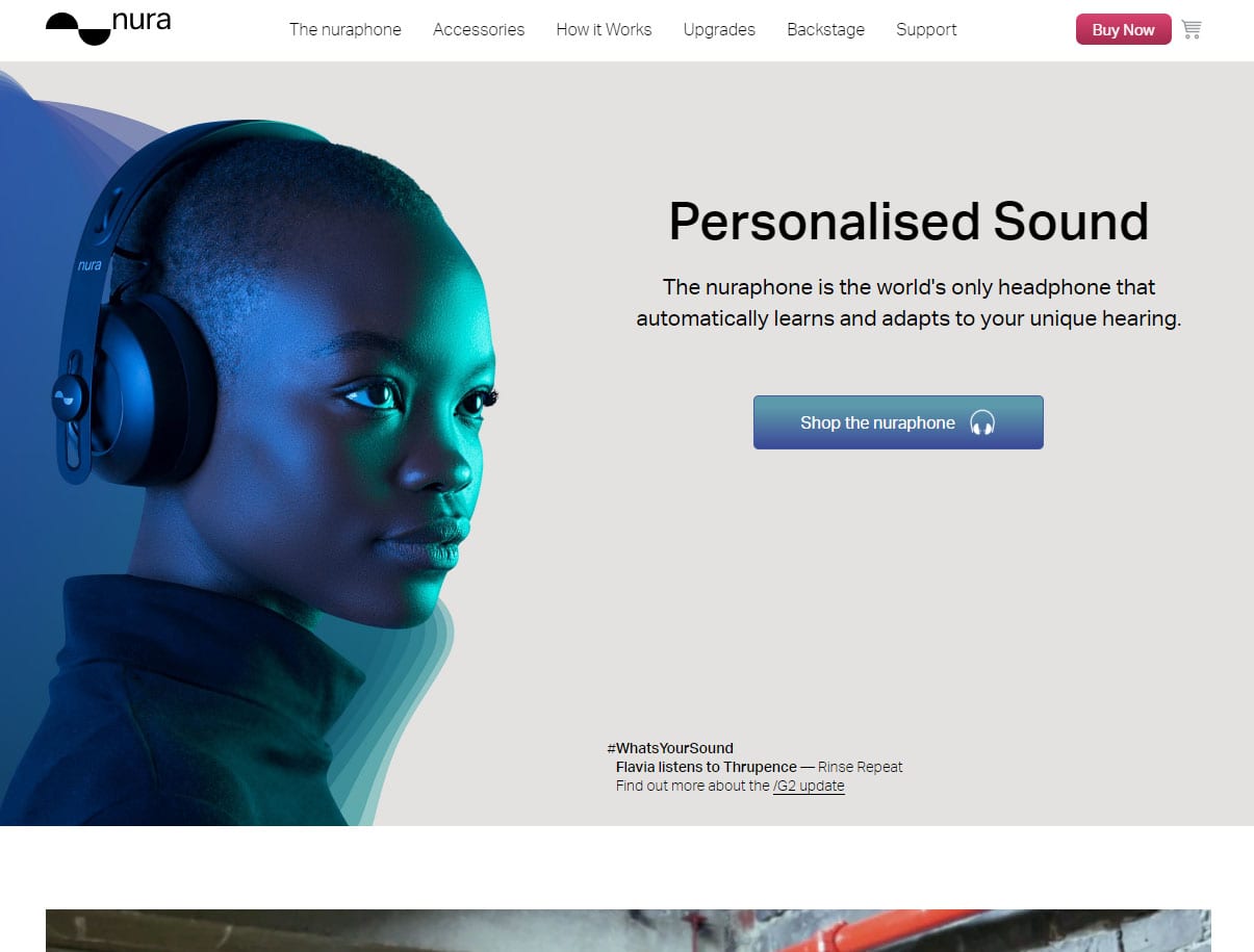
HTTPS://WWW.NURAPHONE.COM/
Every page on this site is dedicated to this one product: educating you about it, teaching you how it works, and selling you on why it’s better than any other headphones on the market.
For Nuraphone, this is a pretty natural choice. They only have one primary product, so of course they’re going to focus their whole website on it.
But what if you have multiple products in your ecommerce store? Can you still take advantage of the mini-site layout?
It turns out that yes, you can. In fact, Ezra has been experimenting with a new way of using mini-sites that makes them a viable product landing page template for anyone with an ecommerce store.
How to use mini-sites as part of a bigger online store.
Another option is to create a mini-site that lives within your normal store.
Here’s an example of what that looks like:
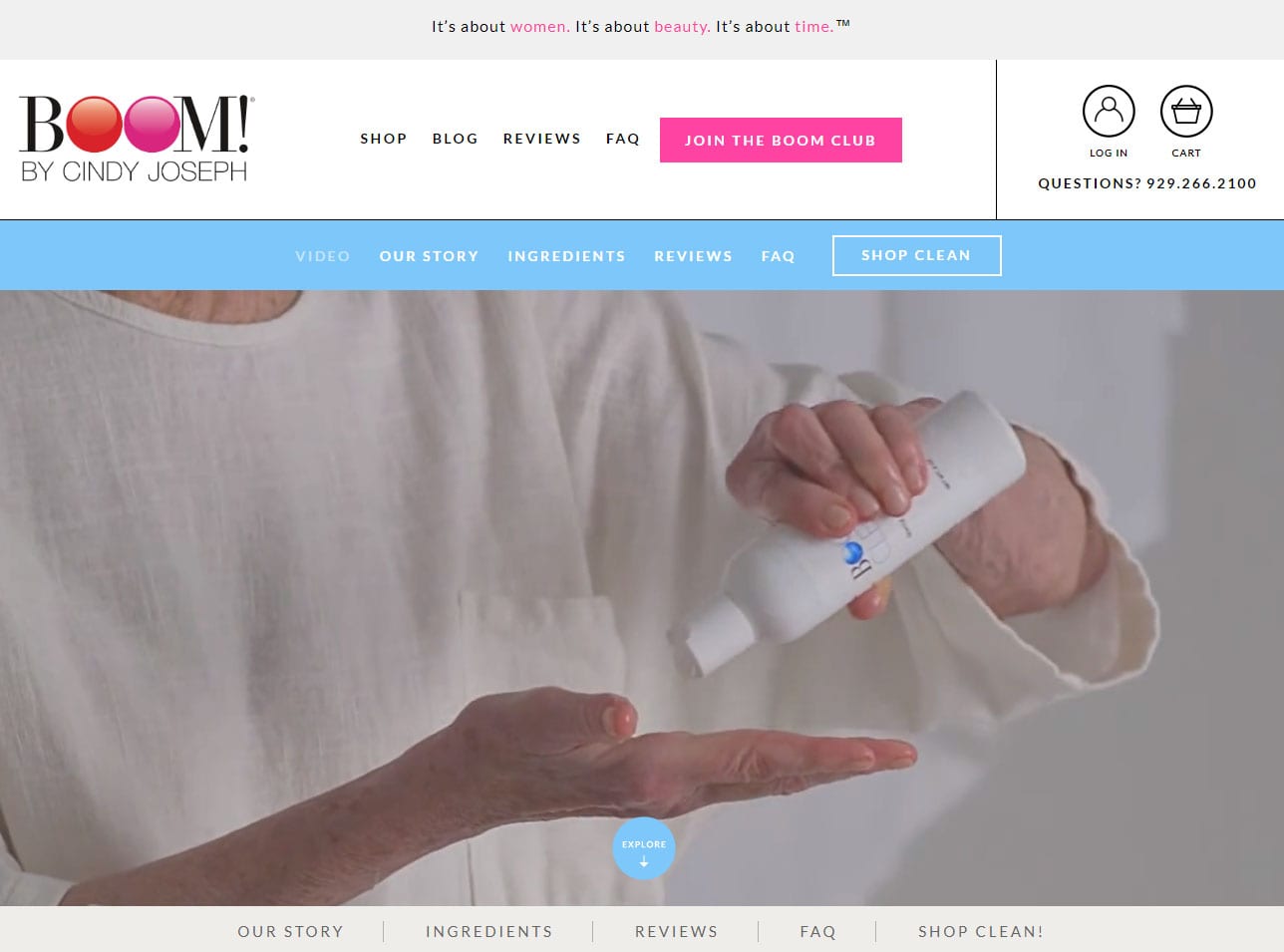
BOOM CLEAN
Next, we’ll walk through this site to show you how it works and how you can adapt the same strategy for one of your own products.
EXAMPLE OF A MINI-SITE
For this example, we’re going to focus on the mini-site for one of BOOM!’s new products, Boom Clean.
This way, you’ll get to see what a high-converting mini-site looks like, and you’ll learn how to leverage one as part of a larger ecommerce store.
The trick to using a mini-site as part of a bigger store is through the use of a secondary menu located directly underneath your main website navigation.
Here’s a closer look at the menu for Boom Clean so you can see how it works:

This makes it easy to navigate the mini-site, and you can also go back to the main site anytime you want.
Ease of navigation is probably the biggest benefit to using a mini-site. You can leverage all the same conversion elements you would use on a long-form page, but on a mini-site it’s easier to find exactly what you’re looking for.
Boom Clean’s mini-site consists of 6 pages dedicated to the video, the product story, the ingredients, the reviews, the frequently asked questions, and the “Buy” page (which, you’ll notice, is laid out just like a traditional Shopify product page:)
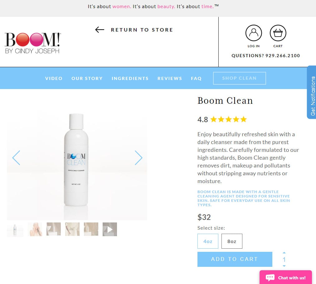
Remember how Purple Mattress put a sticky header at the top of their long-form sales page, so that you always had a “Buy Now” button showing up on the screen?
Well, in this case making the header sticky could get tricky. (Wow, try saying that 10 times fast.) The BOOM! website already has a main header and a pre-header. When you add the mini-site sub-header, you’ll probably have too much going on at the top of the page.
So what Boom Clean does instead is use a sticky footer. So that on every page of the mini-site, you’ll always have a menu and a “Buy” button located at the bottom of the screen:

Putting the sticky menu here helps keep the header from getting too cluttered.
Oh, and speaking of that header: one thing to think about when creating a mini-site is how to handle the 2 menus on mobile.
For Boom Clean, Ezra decided he didn’t want to use 2 different “Menu” buttons because that could be confusing. Instead, he uses one “Menu” button that loads both the top-level navigation and the mini-site navigation.
Here’s what it looks like:
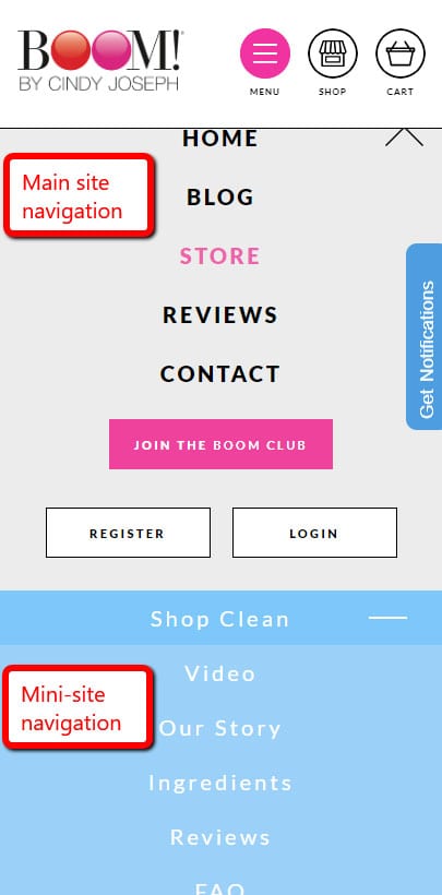
As you can see, mini-sites are a little more complex due to the need for a menu. But they’re well worth your time and effort, especially for a really important product.
(READ MORE – This New Product “Mini-Site” Sales Page is the Best of Both Worlds)
WHAT’S THE BEST TYPE OF SHOPIFY LANDING PAGE?
Now that we’ve covered the 3 main types of Shopify landing pages, the question you probably want to ask is this:
Which of these pages is the best?
The truth is, there’s no right answer to that question. They can all work.
Depending on your product, however, one type might make more sense than another. If you’re selling a low-priced item that doesn’t need much explanation, a traditional landing page might be your best bet.
On the other hand, if your product is expensive and requires a lot of education to sell, then you’re probably better off using a long-form landing page or a mini-site.
(Again, no matter the cost of your product, if you’re selling something unique—something that you’re proud of—then you have plenty of opportunity to write compelling copy to include on your website.)
But in the end, the most important thing isn’t necessarily the structure of your page; it’s the actual content on that page.
So use the guidelines in this article to help figure out the best landing page structure for your product, but don’t get too hung up on it. The really important thing to make sure of is this:
How can you successfully leverage all the conversion elements that will help make your page more persuasive to visitors?

